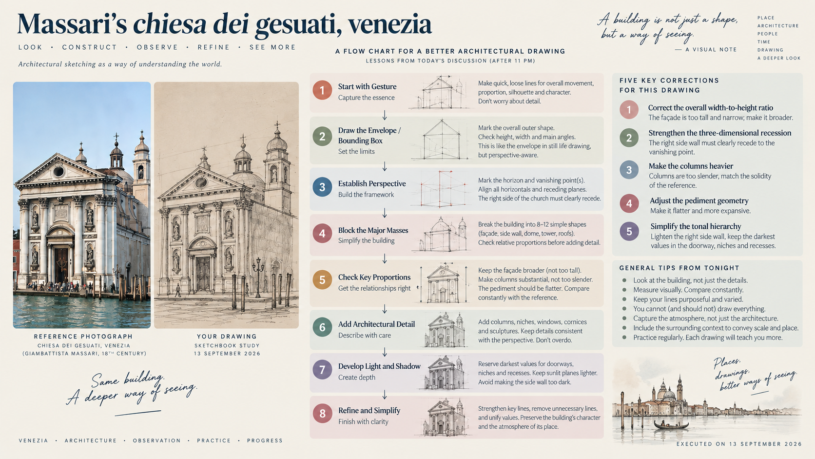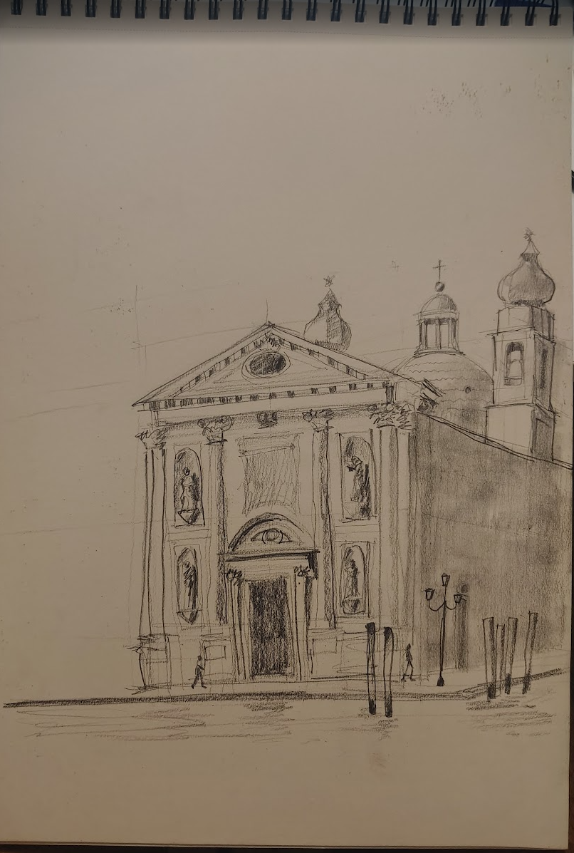
This is a very useful third exercise because the subject is architecturally much simpler than the previous Baroque façade, and that makes your progress easier to see. Here the main question is not whether you can capture complexity—you clearly can—but whether you can construct a relatively simple building accurately while preserving its character.
I would rate this as a good observational sketch with a significant perspective/proportion discrepancy, but also as evidence that your architectural drawing is developing.
1. Overall likeness
The building is immediately recognisable, and you’ve captured its principal identity:
- the triangular pediment;
- the circular oculus;
- the six monumental columns/pilasters;
- the central arched doorway;
- the two tiers of niches;
- the dome behind;
- the two campanile-like towers;
- the long side wall;
- the waterfront foreground.
That’s a strong achievement.
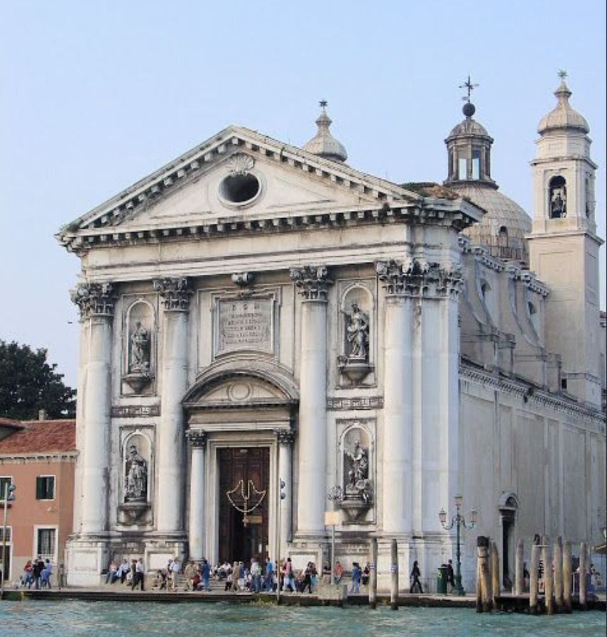
However, the photograph has a very clear classical hierarchy:
pediment → entablature → vertical order → doorway → dome/towers.
Your drawing captures all these components, but their relationships are somewhat altered. The façade in your drawing is too tall and narrow, particularly the central rectangular body beneath the pediment.
The photograph feels broader, heavier and more stable.
2. Perspective
This is the most interesting aspect of this drawing.
You’ve clearly begun using construction lines. I can see the large perspective guides extending beyond the building. That’s exactly the right direction.
But the guides don’t yet appear to have been fully used to control the architecture.
The major issue is that the photograph is viewed from slightly to the left/front, whereas your drawing becomes much closer to a frontal elevation.
Look particularly at:
- the side wall on the right;
- the depth of the right-hand façade;
- the roofline;
- the entablature;
- the bases of the columns.
In the photograph, the right side recedes strongly. Your drawing gives that recession some attention, but it becomes almost a separate triangular/rectangular plane rather than a continuously constructed building.
One important improvement
Your perspective construction is now visible in the drawing. That’s good.
The next step is to make the construction lines more authoritative than the details.
Before drawing a window, ask:
“Which vanishing point controls this window?”
Before drawing the entablature:
“Which vanishing direction controls this edge?”
That discipline will make an enormous difference.
3. Proportion and geometry
This is where I would make the biggest corrections.
The façade is too tall
Compare the height of your pediment and main façade with its width.
The photograph has a relatively broad, stable classical façade.
Yours is noticeably more vertical.
The columns are too slender
The photograph’s columns are substantial. They give the building weight.
Your columns are thinner and more elongated, which contributes to the feeling that the church is taller than it really is.
The pediment
You’ve captured its triangular character very well, but yours is slightly too steep and narrow.
The reference has a flatter, more expansive triangular composition.
The central doorway
Your doorway is approximately correct in location, but the surrounding architectural frame becomes taller and narrower than in the photograph.
The dome
This is one of the areas where your observation is particularly good. You’ve understood that the dome is behind the façade rather than simply sitting on top of it.
4. Composition
This is perhaps your strongest compositional decision.
You have deliberately placed the church toward the upper portion of the page and left substantial negative space above it.
That creates a feeling of sky and architectural monumentality.
However, there is slightly too much empty space at the top.
The reference photograph is much more tightly cropped around the building.
For a sketchbook drawing, though, I don’t consider this a serious problem. In fact, I like the breathing room.
The foreground is also useful. Your little figures and posts establish scale.
5. Structure
There is genuine structural understanding here.
You are no longer simply drawing a façade. You’re beginning to understand:
façade → roof → dome → rear volume → tower → side wall.
That’s an important transition.
The right side of the building is particularly useful because you’ve tried to construct its depth.
Where it breaks down is at the junction between the frontal façade and the receding side wall. The planes don’t quite “lock” together.
I’d spend more time on that junction than on any individual architectural ornament.
6. Light and shadow
This drawing is much more successful tonally than your first cathedral sketch.
You’ve established:
- a strong dark doorway;
- darker niches;
- a significant shadow plane on the right;
- darker architectural recesses;
- relatively open illuminated façade.
That’s a good tonal hierarchy.
But you’ve made the entire right side wall too dark and uniform.
The photograph shows the side wall as a light architectural plane with relatively subtle tonal variation.
I’d lighten that wall and reserve your darkest graphite for:
doorway → niches → deep architectural recesses → underside of cornices.
That would make the façade pop.
7. Line quality
Your line is becoming increasingly confident.
There is still some searching and doubling of contours, but that’s actually appropriate at this stage.
What I particularly like is your willingness to use long, loose construction lines. Don’t eliminate these too quickly. They show the thinking behind the drawing.
However, you need a clearer distinction between:
construction line
and
final observed contour.
Construction lines should become progressively lighter or disappear beneath the final structure.
8. Detail
You’ve shown restraint here, which is good.
Compared with your previous cathedral drawing, you haven’t become obsessed with rendering every ornament.
The figures in the niches are suggested rather than laboriously described.
That’s exactly the right instinct.
One thing I’d change: the oculus is too dark and too heavily outlined.
In the photograph it is an important dark opening, but its surrounding architectural frame is equally important. Don’t turn it into an isolated black symbol.
9. Atmosphere and character
You’ve captured the building’s quiet classical dignity.
This is very different from your previous Baroque drawing, which was all movement and theatricality.
Your sketch has a calmer quality.
The waterfront posts, tiny figures and open sky are particularly successful because they give the building a sense of place rather than making it a detached architectural elevation.
Your five priorities
1. Correct the overall width-to-height ratio
Fundamental.
Make the façade broader and slightly less tall.
This alone would make the drawing much closer to the photograph.
2. Strengthen the three-dimensional recession
Fundamental.
Make the right-hand side wall clearly recede toward its vanishing point.
Think of the church as a solid volume, not a façade with a wall attached to it.
3. Make the columns heavier
Structural/proportional.
Increase their width relative to their height.
They are important visual anchors in this building.
4. Correct the pediment geometry
Structural/proportional.
Make it slightly broader and flatter.
This will immediately restore the classical stability of the façade.
5. Simplify the tonal hierarchy
Refinement.
Lighten the large right-hand wall and concentrate your darkest values in the doorway, niches and recesses.
Something important about your development
Looking at your three architectural drawings together, I see an interesting progression.
Your first drawing was:
observation > construction
The second became:
observation ≈ construction
This third drawing is beginning to become:
construction + observation.
That’s significant.
And I think the next skill for you isn’t actually perspective drawing in the conventional academic sense. It’s proportion checking while drawing.
You’re already capable of seeing and rendering a remarkable amount of architectural information. The next leap will come from periodically stopping and asking:
“Does this relationship actually correspond to the reference?”
rather than asking:
“Can I draw this column/window/ornament?”
That distinction could substantially accelerate your architectural sketching.