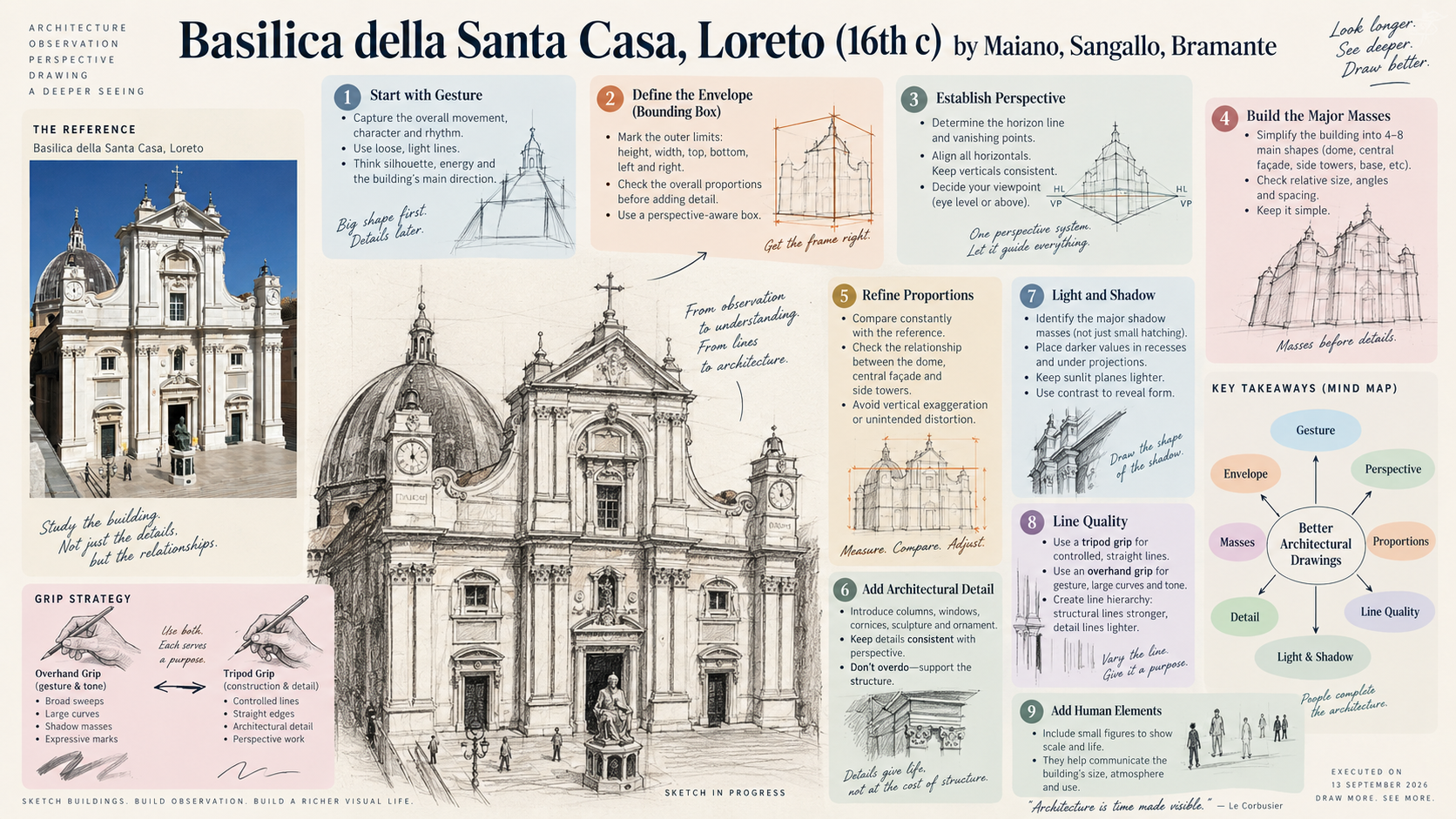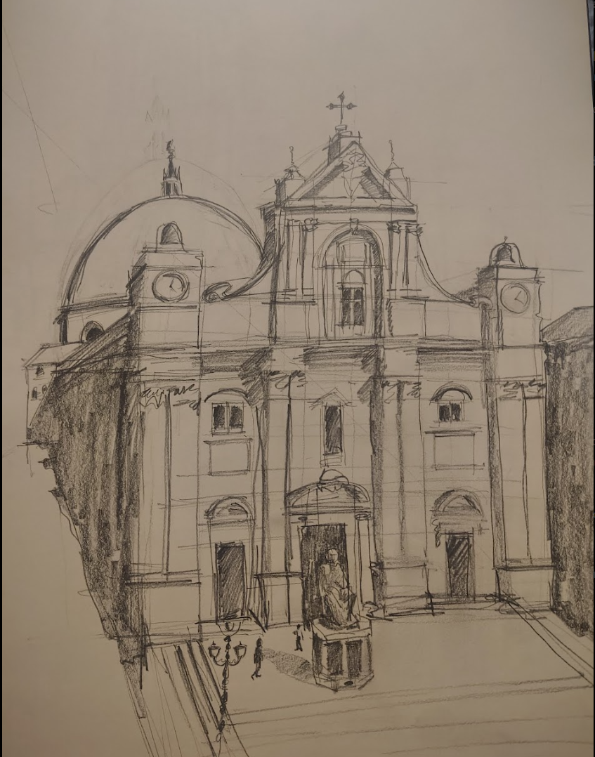
This is an interesting step forward because I can now see something quite different from your previous two architectural studies: you are beginning to construct the building rather than merely transcribe it. And your observation about the tripod grip is particularly relevant here.
The drawing has a much stronger architectural skeleton than your earlier Baroque church drawing.
Overall likeness
The likeness is strong at the level of architectural idea, but less exact at the level of proportion.
The most successful elements are:
- the enormous left dome;
- the central pedimented mass;
- the two clock towers;
- the sweeping S-curves connecting dome and central façade;
- the strong central vertical axis;
- the statue and forecourt;
- the overall three-part façade.
I can identify the building immediately.
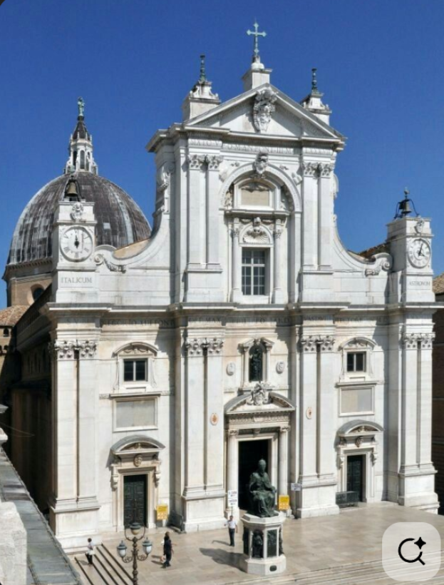
But your drawing makes it feel more monumental, taller and more vertically stretched than the reference. The reference has a much broader, calmer horizontal façade.
That’s not necessarily a bad artistic decision—but it is an important distinction between observational accuracy and interpretation.
Perspective: a significant improvement
This drawing demonstrates something I think is particularly important for your development.
Your tripod grip seems to have helped.
Look at the long architectural lines: the cornices, verticals, horizontal bands, window surrounds and central façade. They have considerably more control than in your previous cathedral study.
But there is still a perspective issue:
You are mixing perspective systems.
The foreground and some horizontal architectural elements suggest a viewpoint from above, while portions of the façade behave more like a relatively frontal elevation.
The reference photograph is itself taken from a high-ish viewpoint. You can see the tops of architectural projections and the forecourt, while the façade still has strong vertical presence.
Your drawing exaggerates this slightly.
The result is that the building sometimes feels as though it is tilting upward toward the viewer.
The biggest proportion issue
The dome is the key.
In the photograph, the dome occupies a large horizontal mass but is visually integrated into the left side of the composition.
In your drawing, the dome becomes almost a giant semicircular graphic device.
Its curvature is beautifully observed, but you’ve increased its visual dominance.
Likewise, the central building is somewhat narrower and taller than the photograph.
So your interpretation has shifted toward:
dome → central tower → symmetrical façade
whereas the photograph reads more like:
broad façade → dome emerging behind it → central emphasis.
That’s worth watching.
Your envelope is much better
This is exactly where our previous discussion becomes useful.
You seem to have established the overall envelope and major masses before detailing, and it shows.
The building is organised into:
- left dome;
- left clock mass;
- central façade;
- right clock mass;
- lower horizontal base;
- foreground.
That is a much healthier construction strategy.
And notice something important:
You have not drawn everything you see.
That’s progress.
Your gesture is also visible
The initial gesture seems to have captured the building’s major movement:
large dome → sweeping curve → central pediment → sweeping curve → clock tower.
That’s actually a very good example of what I meant by gesture earlier.
The gesture isn’t merely a preliminary sketch underneath the finished drawing. It remains perceptible in the final drawing.
That’s valuable.
Line quality
This is probably your best architectural line work so far.
There is a clear difference between:
- long structural lines;
- architectural contours;
- darker recesses;
- hatching;
- small details.
The tripod grip seems particularly effective for the vertical architectural vocabulary.
But don’t let this become too mechanical.
Your overhand work is still useful for the enormous dome, shadow masses and foreground. The drawing benefits from the contrast between controlled architecture and loose graphite.
I’d retain that contrast deliberately.
Light and shadow
This is where your interpretation becomes quite expressive.
The left side of the building is substantially darker than the central façade, and you’ve used the large shadow beneath the cornice effectively.
However, you’re sometimes using hatching to describe darkness rather than allowing the shadow itself to become a single shape.
Try this next time:
Don’t draw the shadow. Draw the shape of the shadow.
For example, the underside of the central cornice could be one coherent dark mass rather than numerous individual strokes.
That would make the architecture feel considerably more solid.
One thing I particularly like: the people
The tiny figures are doing real work.
They establish:
- scale;
- distance;
- movement;
- architectural grandeur;
- the relationship between architecture and human occupation.
And because they’re loose, they don’t compete with the building.
Keep doing this.
For architectural drawing—and especially for your graphic-novel ambitions—figures are not merely decoration. They are measuring instruments and narrative devices.
The five priorities for this drawing
1. Control the overall proportion
Fundamental.
Reduce the apparent vertical exaggeration and check the dome/central façade relationship.
2. Establish one coherent perspective system
Fundamental.
Before drawing architectural divisions, determine how the major horizontal planes actually converge.
3. Treat the dome as a mass, not an outline
Structural/tonal.
Its curve is good, but think of the dome as a three-dimensional volume sitting behind the façade.
4. Consolidate shadow masses
Major refinement.
Replace some of the small hatching with larger, deliberate dark shapes.
5. Preserve the grip distinction
Process refinement.
Use:
tripod → architectural construction
overhand → gesture, dome curves, shadow and atmosphere
rather than choosing one grip for the whole drawing.
And here’s the really interesting development
Looking at your three architectural drawings together, I see a progression:
Drawing 1:
Observation > construction
Drawing 2:
Observation ≈ construction
Drawing 3:
Construction beginning to support observation
That’s exactly the direction you want.
You’re also discovering something important about architectural drawing: the discipline isn’t about making your drawing more rigid. It’s about giving your expressive line a structural intelligence.
Your next leap probably won’t come from learning more architectural details. It will come from becoming much better at envelope → perspective → mass → proportion.
And I think the fact that you independently noticed the grip issue is a very good sign: you’re beginning to notice not just what you’re drawing, but how your body is producing the drawing.