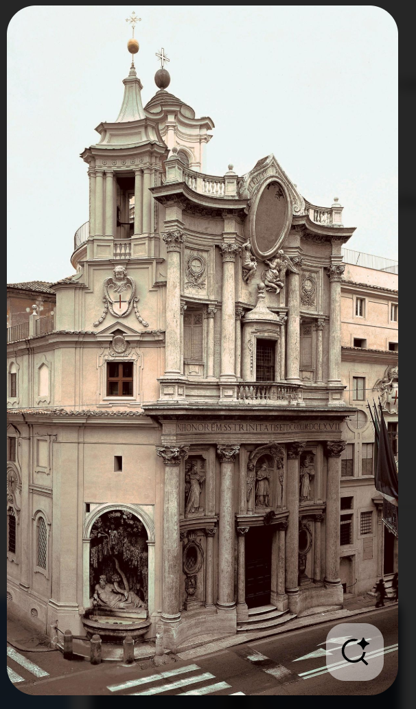
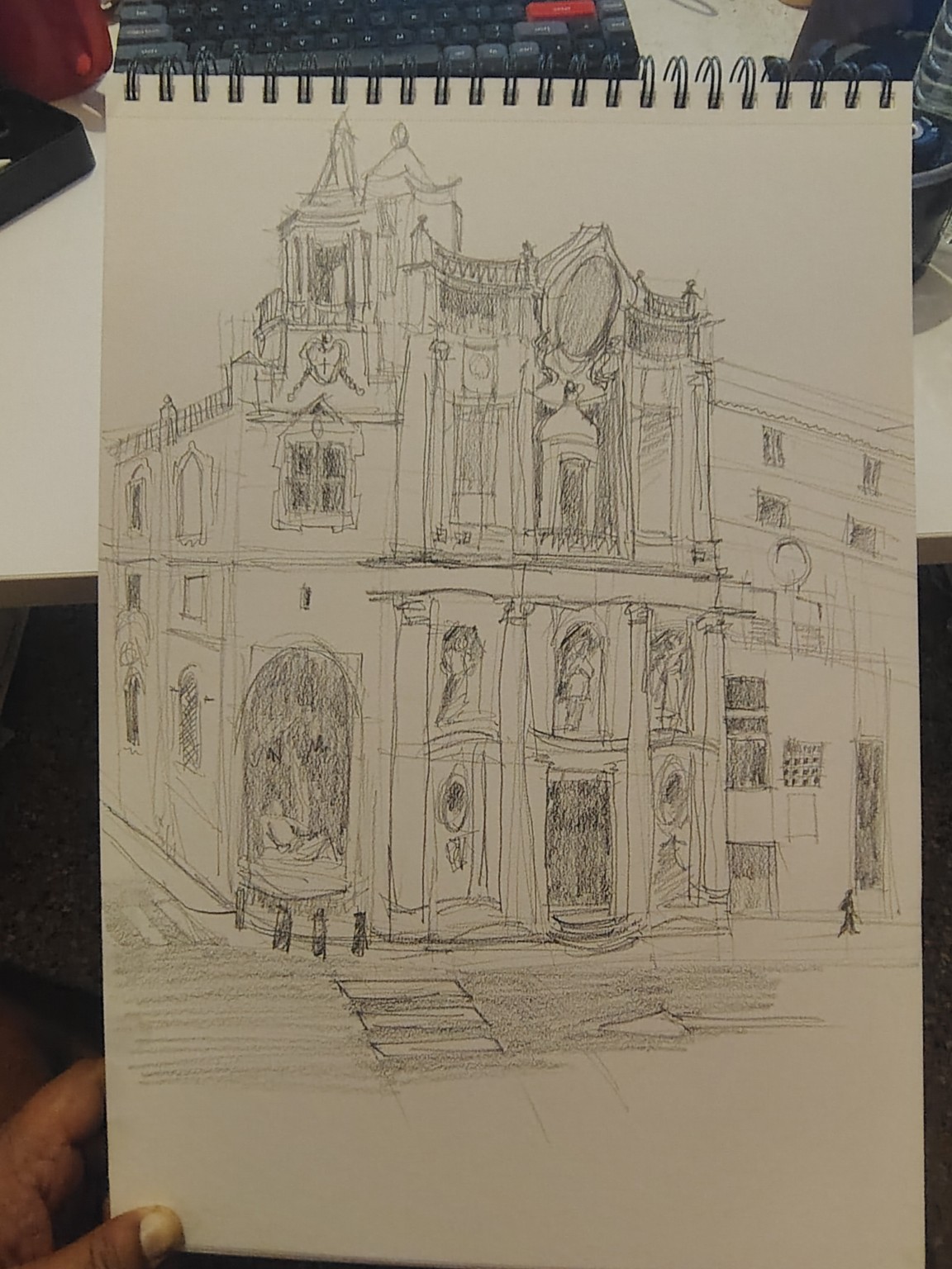
Your drawing shows strong observational engagement with the building: you have clearly understood that this is not simply a façade of stacked rectangles, but a highly theatrical Baroque composition of projecting, receding, curved and sculptural elements. The central façade, twin upper structures, oval, columns, statues and lower arcade are all recognisable.
The main issue, however, is that your observation of individual details is currently ahead of your control of the large-scale geometry. In other words, you are seeing the building well, but the drawing’s underlying construction has drifted. This is very common in architectural sketching, and correcting the large relationships would make the drawing dramatically more convincing without requiring more detail.
1. Overall likeness
Quite good at the level of character; weaker at the level of exact structure.
I can immediately recognise the same building from your drawing. You have successfully captured several of its most distinctive identifiers:
- the tall bell-tower-like structure on the upper left;
- the smaller domed/curved structure beside it;
- the sweeping Baroque cornices;
- the large oval cartouche;
- the central sculptural group;
- the vertical rhythm of the lower façade;
- the large arched niche on the lower left;
- the deep central entrance.
Most importantly, you haven’t reduced the building to a generic classical façade. Its eccentricity and theatricality survive.
But your drawing makes the building feel wider, flatter and more symmetrical than the photograph. The reference has a considerably stronger vertical thrust, especially in the upper half.
2. Perspective
This is the area requiring the most attention.
The photograph is taken from a relatively low viewpoint looking slightly upward. Consequently:
- vertical elements remain broadly vertical but have subtle perspective effects;
- horizontal architectural lines have coherent convergence;
- the right-hand side recedes noticeably;
- the upper architecture occupies substantial visual height.
In your drawing, the horizontal construction lines are not governed by a sufficiently consistent perspective system. Several major bands—the cornice separating the upper and lower sections, the lower entablature, balcony lines and ground plane—don’t quite agree with one another.
There is also a tendency to make verticals slightly diverge or lean independently, rather than allowing them to respond to a common vanishing structure.
The lower façade especially feels as though it has been drawn as a relatively flat frontal elevation. The photograph, by contrast, has much stronger spatial recession.
How to improve it
Before drawing any detail, establish:
- Horizon/eye level
- The dominant vanishing direction of horizontal architectural lines
- Major vertical axes
- The building’s bounding envelope
- The main horizontal divisions
Then construct the façade inside that framework.
For this particular building, I would deliberately spend the first 10–15 minutes drawing almost nothing recognisable—only perspective lines, boxes, axes and major masses.
3. Proportion and geometry
This is your biggest structural problem.
The lower building is too wide
In the photograph, the monumental central façade occupies a more compact, vertically compressed footprint. In your drawing, the lower section spreads considerably further left and right.
Your left wing in particular becomes a large horizontal mass. This changes the entire character of the building.
The upper section is relatively undersized
The photograph’s upper architecture rises dramatically above the lower entablature. Your upper portion is smaller relative to the whole drawing.
Consequently your building reads approximately as:
wide + low + horizontal
whereas the reference reads:
narrower + taller + vertically dramatic.
The central façade has also widened
Your columns and bays are spaced more generously than in the reference. The photograph has a remarkable compression of architectural elements: columns, niches, statues and mouldings are packed tightly together.
Your drawing gives those elements more breathing room.
The large oval
You’ve identified it very well, but its placement and shape are somewhat off. In the photograph it is a dominant vertical-ish oval sitting tightly within the curved Baroque framework. In yours it becomes slightly larger and more detached from the surrounding architecture.
This is a good example of something where shape and placement matter more than detail.
4. Composition
Your composition is actually quite effective as a sketch.
You have chosen a frontal three-quarter-ish view and allowed enough space around the building to see the street and ground plane. The lower foreground gives the architecture somewhere to “stand.”
However, compared with the photograph, your building occupies a broader and shorter visual field.
The photograph has an almost portrait-like vertical composition. Your drawing’s architectural mass is closer to a landscape-oriented composition within the page.
The negative space above the building is also somewhat larger than necessary.
One thing you did well
You haven’t simply copied the photograph’s cropping. You’ve made a drawing that feels like a deliberate architectural study. That’s a good instinct.
5. Structure
There is a very promising understanding of structure underneath the drawing.
You clearly understand:
- primary and secondary masses;
- projection and recession;
- column-bearing systems;
- niches;
- cornices;
- balconies;
- sculptural attachments;
- the distinction between the building’s central body and side wings.
But some elements appear to have been drawn by visual approximation rather than constructed in perspective.
The central entrance is a good example. You understand where it belongs, but the surrounding columns and entablature don’t quite establish a convincing three-dimensional enclosure.
Likewise, the lower columns sometimes appear to float slightly because their bases, shafts and entablatures aren’t locked into the same perspective system.
Think “construct → observe → describe,” rather than “observe → describe.”
6. Light and shadow
This is currently underdeveloped, but that is understandable given the stage of the drawing.
The photograph has an exceptionally useful lighting situation. There are strong dark recesses beneath:
- the upper tower;
- balconies;
- cornices;
- niches;
- the central doorway;
- sculptural recesses.
These darks give the architecture its depth.
Your drawing records some of them, particularly the central doorway and large lower-left niche, but the tonal hierarchy isn’t yet sufficiently differentiated.
At present, much of the building sits within approximately the same graphite value range.
A better hierarchy would be:
Darkest
- deep doorways;
- window interiors;
- recessed niches;
- undersides of projecting cornices.
Middle
- columns and mouldings;
- shadowed façade planes;
- sculpture.
Lightest
- sunlit wall planes;
- projecting stone surfaces.
Don’t try to shade everything. Selective darks will create much more architecture than uniform shading.
7. Line quality
This is one of the most interesting aspects of the drawing.
Your line is lively and exploratory, which suits this architecture extremely well. You haven’t produced a sterile technical drawing.
There is good variation between:
- construction lines;
- contour lines;
- architectural edges;
- hatching;
- sculptural marks.
But the hierarchy isn’t yet controlled.
Many important edges have approximately the same visual weight as secondary details. Consequently the eye doesn’t always know what is structurally important.
You also sometimes correct a line by repeatedly going over it. That creates a slightly fuzzy contour.
Aim for three levels:
1. Structural contour — strongest
Major silhouette, major cornices, principal columns.
2. Secondary architecture — medium
Mouldings, window frames, niches, balconies.
3. Texture/detail — lightest
Stone, sculpture, minor ornament, hatching.
Your loose exploratory line can remain. Just give it a hierarchy.
8. Detail
You have observed an impressive amount.
Particularly successful are:
- the upper tower;
- the curved roof/cornice;
- the oval;
- the sculptural group beneath it;
- the shield-like ornament on the left;
- the statues in the lower bays;
- the large lower-left niche;
- the street-level steps.
However, you have spent too much attention on details before completely solving the underlying proportions.
This is visible in the lower façade: individual figures and niches are carefully indicated, while the overall spacing between the bays remains inaccurate.
This is the classic architectural-sketch trap:
The drawing becomes more detailed while becoming less accurate.
At your current stage, another 20 minutes of detail would produce less improvement than 5 minutes correcting the main geometry.
9. Atmosphere and character
This is probably the strongest qualitative achievement of the drawing.
The reference building has a wonderfully excessive, almost theatrical Baroque character. Your sketch retains that.
The slightly nervous graphite line actually contributes to the feeling of an old, complicated, accumulated building. The sketch doesn’t feel mechanical.
What is missing is materiality.
The photograph suggests:
- pale weathered stone;
- deep recesses;
- accumulated grime/shadow;
- hard architectural edges;
- soft sculptural surfaces.
You can evoke that with fewer but more decisive tonal masses, rather than more hatching.
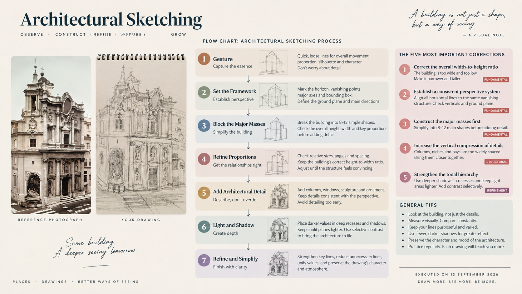
The five most important corrections
I’d rank them very firmly like this:
1. Correct the overall width-to-height ratio
Fundamental structural problem.
Make the building significantly narrower relative to its height, particularly the lower section.
Why: This will immediately restore the monumental vertical character of the reference.
2. Establish a consistent perspective system
Fundamental structural problem.
Determine the horizon and dominant vanishing points before reconstructing the major horizontal bands.
Pay particular attention to:
- lower cornice;
- balcony;
- main entablature;
- rooflines;
- street/curb.
Why: Once these agree, the building will suddenly feel physically constructed rather than assembled from individual observations.
3. Reconstruct the major masses before touching detail
Fundamental structural problem.
Reduce the building temporarily to perhaps 8–12 major shapes:
- left lower mass;
- right lower mass;
- central lower façade;
- upper central body;
- left tower;
- right upper structure;
- oval;
- major curved cornices;
- ground plane.
Correct these relationships first.
Why: Architectural likeness comes overwhelmingly from these large relationships, not from ornament.
4. Increase the vertical compression of the architectural details
Structural/secondary problem.
Bring the columns, statues, niches and bays closer together and reduce the horizontal spacing between them.
Your façade currently feels more spacious than the photograph.
Why: The reference’s Baroque intensity comes partly from the density of architectural information.
5. Establish a stronger tonal hierarchy
Refinement, but with a major visual payoff.
Don’t add more shading everywhere. Instead, deliberately place the darkest graphite in the deepest recesses and beneath projecting elements.
Then leave the illuminated stone relatively open.
Why: This will give your already good line drawing much greater depth and make the sculptural architecture emerge from the page.
The central lesson
If I were teaching you this drawing in person, I would actually stop you from adding detail right now.
Your observational ability is not the main limitation here. You are seeing plenty. The limitation is translating what you see into a controlled spatial framework.
Your next architectural drawing should therefore follow this sequence:
gesture → bounding box → horizon → vanishing structure → major masses → major proportions → architectural divisions → shadow masses → details → texture.
At the moment, you’ve effectively gone:
gesture → major masses → details → more details → partial perspective correction.
Reverse that order.
And there is a particularly encouraging thing here: I wouldn’t ask you to become more precise by becoming more rigid. Your loose, searching graphite quality is worth preserving. The goal is to put a much stronger geometric skeleton underneath that expressive line.
Key Takeaways
- Recognition/character: strong.
- Observation of ornament: strong.
- Perspective: the principal weakness.
- Overall proportions: the major weakness, especially excessive width.
- Spatial construction: promising but inconsistent.
- Line quality: expressive, but needs hierarchy.
- Tone: currently too uniform.
- Architectural personality: successfully captured.
Call to Action
For your next pass, don’t redraw the whole thing from scratch. Take your existing drawing and, using a very light pencil, mark:
- the building’s true outer envelope;
- its central vertical axis;
- the horizon;
- the principal vanishing directions;
- the major horizontal divisions;
- the true width of the lower façade.
Then compare those six things directly against the photograph before correcting a single statue, column or ornament.
That exercise will teach you far more about architectural drawing than adding another layer of detail.
What do you mean by gesture in architecture? Please explain in 100 words
In architectural sketching, gesture means the quick, loose first indication of a building’s overall movement, character, proportion and visual energy before you construct its precise geometry.
Think of it as the building’s “first impression” translated into a few lines.
For your church drawing, a gesture might be a few light strokes establishing:
- the overall height and width;
- the dominant vertical axis;
- the sweeping movement of the Baroque façade;
- the position of the major towers;
- the general silhouette;
- the direction and energy of the composition.
It is not detail or accurate construction. It is the initial visual framework that you subsequently refine into perspective, proportion and architectural detail.
Prompt for ChatGPT:
I am attaching two images:
- Reference photograph — the architectural subject I am drawing.
- My architectural drawing — my interpretation of the photograph.
Critique my drawing carefully by comparing it directly with the reference photograph. Approach this as an experienced architectural artist, sketching instructor, and visual critic. Be constructive, specific, and technically rigorous rather than merely complimentary.
Evaluate the drawing under the following headings:
- Overall likeness: How convincingly does the drawing capture the character, identity, and visual impression of the building?
- Perspective: Assess vanishing points, horizon line, convergence of verticals and horizontals, foreshortening, and spatial depth.
- Proportion and geometry: Identify inaccuracies in the relative sizes, angles, dimensions, spacing, and relationships between architectural elements.
- Composition: Evaluate framing, cropping, visual balance, scale, focal point, and use of negative space.
- Structure: Assess whether the underlying architectural construction feels convincing and three-dimensional.
- Light and shadow: Compare the direction, intensity, values, and placement of major light and shadow masses.
- Line quality: Assess confidence, variation, hierarchy, rhythm, and whether lines communicate form effectively.
- Detail: Evaluate which architectural details are successfully observed and which are missing, exaggerated, or unnecessarily emphasized.
- Atmosphere and character: Discuss whether the drawing captures the mood, age, materiality, and distinctive qualities of the architecture.
Finally, identify the five most important corrections I should make, in order of priority, and explain how each correction would improve the drawing. Distinguish between fundamental structural problems and minor refinements.