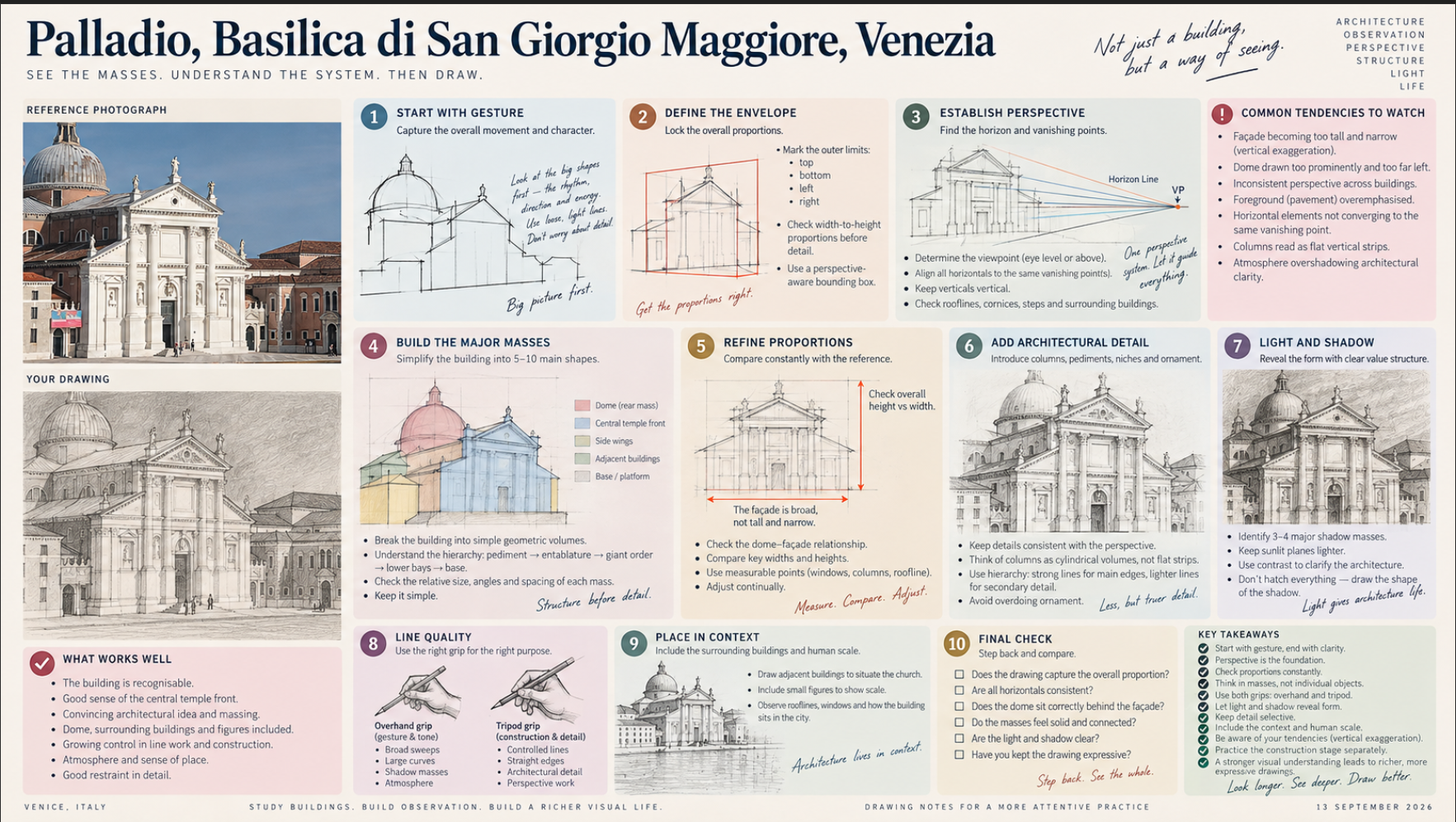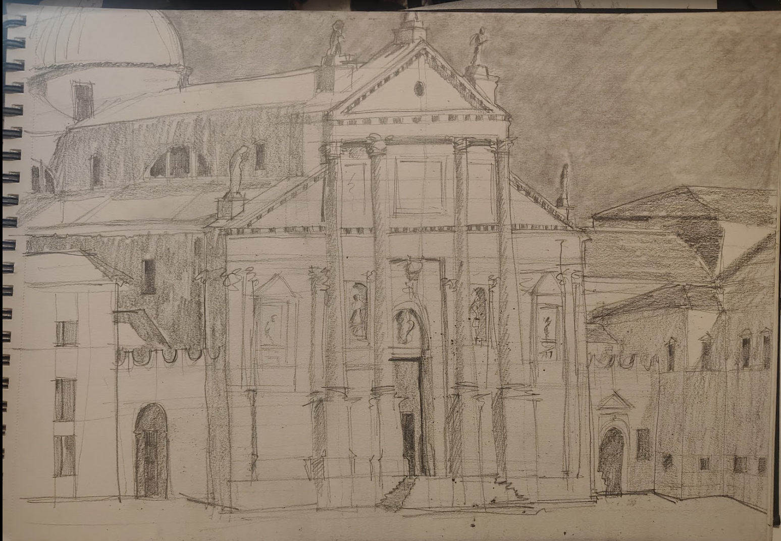
This is a very useful drawing for assessing your development, because the Basilica di San Giorgio Maggiore presents a completely different architectural problem from the earlier Baroque façades. Palladio gives you large geometric masses, classical order, symmetry, and relatively restrained ornament. That makes your successes and weaknesses easier to see.
My overall assessment: your constructional thinking is improving, but your perspective and proportion are still competing with your observation. At the same time, your ability to capture the architectural idea of a building is becoming quite strong.
1. Overall likeness
The drawing captures the identity of San Giorgio Maggiore quite convincingly.
The most successful things are:
- the dominant central temple front;
- the layered temple/pediment composition;
- the large dome behind;
- the two flanking masses;
- the strong central axis;
- the relationship between façade and surrounding Venetian buildings.
I can immediately recognise Palladio’s façade from your drawing.
But there is an important difference:
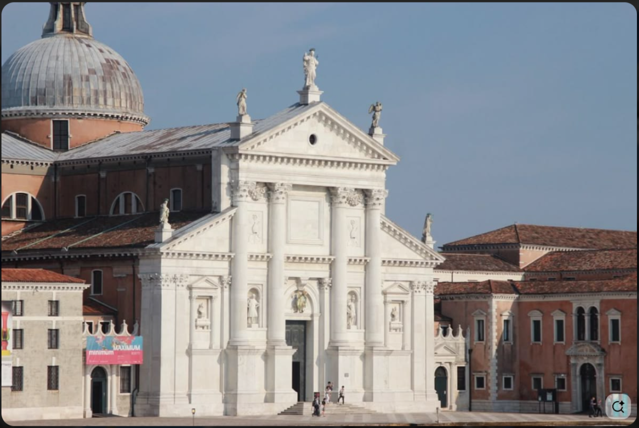
The photograph feels calm, symmetrical and monumental. Your drawing feels slightly more irregular and spatially expansive.
You’ve interpreted the building rather than mechanically copied it—which is good—but some of that interpretation is coming from unresolved geometry rather than deliberate artistic distortion.
2. Perspective
This is still your principal technical challenge.
Interestingly, the problem is less obvious in the façade itself than in the surrounding architecture.
Your central façade is relatively controlled. But the buildings on either side, the pavement and rooflines don’t consistently obey the same perspective system.
Look especially at:
- the horizontal base of the church;
- the cornices of the side buildings;
- the steps;
- the rooflines;
- the pavement.
They seem to establish slightly different vanishing directions.
The photograph gives you a relatively elevated viewpoint: you see substantial amounts of the pavement and roof surfaces. Your drawing captures this, but the perspective is not yet completely unified.
One exercise I’d strongly recommend
Before your next building drawing, lightly extend five or six horizontal edges toward their vanishing point.
Don’t worry about whether the lines become ugly construction lines.
You’re trying to discover:
“What perspective system is this photograph actually giving me?”
Then construct the building inside it.
3. Proportion and geometry
This is where the drawing diverges most significantly from the photograph.
Your central façade is too narrow
The photograph’s main façade has considerable lateral presence. Yours has become somewhat compressed.
The dome is too far left and too exposed
You’ve drawn the dome beautifully as a shape, but you’ve allowed too much of it to appear.
In the photograph, the dome is partially concealed by the central façade. Your drawing exposes more of the dome and therefore makes it a stronger compositional element.
The central pediment is too tall
Your central temple front rises quite dramatically. In the photograph it is broader and more proportionally restrained.
The lower façade is too vertically stretched
Your columns and bays have become taller and narrower.
This is a recurring tendency in your architectural drawings:
You tend to make architecture slightly taller and more vertically dramatic than the reference.
That’s an important personal tendency to watch.
It isn’t necessarily a weakness artistically—but you need to know when you’re doing it.
4. Composition
Your composition is actually very good.
You’ve understood that the church shouldn’t simply be isolated from its environment.
The surrounding buildings, pavement and small figures establish:
building → city → human scale.
That’s particularly important in Venice, where architecture is experienced as part of an urban and water-based environment rather than as an isolated object.
Your foreground, however, is somewhat overemphasised. The large blank/shaded pavement occupies substantial space.
You could have allowed slightly more of the architectural mass to dominate the page.
5. Structure
This is where I think you’re making genuine progress.
Your previous Baroque drawings showed you learning to construct complicated architecture.
Here, you’re beginning to understand architectural hierarchy.
The façade can essentially be reduced to:
large lower body → giant columns → upper temple → pediment → dome behind.
That’s exactly the kind of simplification I want you to develop.
And Palladio is a particularly good subject for this because his architecture rewards structural thinking.
One thing to watch: your columns sometimes read as vertical strips rather than cylindrical volumes. You needn’t render every column anatomically, but give them enough curvature/value to turn them into solids.
6. Light and shadow
Your tonal approach is interesting.
You’ve created a large dark mass on the left and a broad atmospheric tone across the sky and surrounding architecture.
But the reference gives you a wonderful opportunity for architectural chiaroscuro.
Look at the photograph:
- deep shadow beneath the pediments;
- dark recesses behind columns;
- dark doorway;
- shadowed areas beneath projecting cornices;
- bright marble planes;
- dome with subtle tonal modelling.
Your drawing currently gives almost equal importance to atmospheric hatching and architectural shadow.
I’d reverse that.
Think:
Light plane = mostly paper
Shadow plane = deliberate graphite mass
That will make Palladio’s geometry much clearer.
7. Line quality
This drawing reinforces what we discussed about pencil grip.
There is considerably more tripod-controlled line work here.
Your long architectural edges are straighter and more decisive than in your earliest church drawing.
But you’ve also introduced a lot of repeated exploratory lines.
I would now introduce a stronger distinction between:
Construction line
Very light.
Architectural line
Firm and relatively dark.
Shadow/texture
Loose and varied.
At present these three sometimes occupy the same visual register.
The goal isn’t cleaner drawing.
It’s hierarchical drawing.
8. Detail
You’ve been appropriately restrained.
This is important.
You haven’t attempted to draw every Corinthian capital or every decorative element. Instead, you’ve indicated them.
That’s exactly right for this stage.
Your next step is not adding more ornament.
Instead, improve the spacing and rhythm of the existing ornament.
For example, the columns should become a rhythm:
| | | |
rather than four independently drawn objects.
That’s one of the fundamental differences between drawing an object and drawing architecture.
9. Atmosphere and character
The atmosphere is quite successful.
The drawing captures something of Venetian architectural quietness—the pale masonry, broad sky, low surrounding buildings and expansive pavement.
Your graphite texture also gives it a slightly historical, archaeological feeling.
But the reference has extraordinary clarity of light, whereas your drawing is somewhat more uniformly atmospheric.
I would preserve the atmosphere but introduce more clarity inside it.
The five most important corrections
1. Establish the perspective system
Fundamental.
Find the dominant vanishing point(s) and make the pavement, cornices, rooflines and façade divisions agree.
This should come before detail.
2. Correct the vertical exaggeration
Fundamental.
Your façade and central pediment are becoming too tall relative to their width.
This is becoming a recurring tendency in your drawings.
3. Correct the dome–façade relationship
Structural.
Reduce the visible portion of the dome and let the central façade overlap it more convincingly.
This will immediately make the composition closer to the photograph.
4. Turn the façade into a system of masses
Structural/constructional.
Think:
pediment → entablature → giant order → lower bays → base
rather than individual windows, columns and niches.
5. Separate architecture from atmosphere
Refinement.
Keep your atmospheric graphite, but reserve the darkest values for architecturally meaningful recesses.
That will make the drawing both more expressive and more structurally legible.
Something particularly worth noticing
There is a fascinating progression across the architectural drawings you’ve shown me.
Your first Baroque study had:
excellent observation + weak construction
The second became:
better construction + expressive observation
The Loreto study developed:
stronger perspective awareness + controlled line
And now San Giorgio is showing:
increasingly sophisticated massing + a developing architectural vocabulary.
Your next stage is not about becoming a more meticulous draughtsman.
It’s about becoming more architecturally analytical.
When you look at a building, ask yourself before drawing:
What are the 5–10 masses that make this building recognisable?
Then:
What perspective system holds those masses together?
Then:
Where are the three or four important shadow masses?
Only after that:
What details are worth drawing?
That sequence is likely to be much more valuable to you than simply doing increasingly elaborate architectural copies.
Key Takeaways
- Architectural recognition: strong.
- Massing: increasingly good.
- Perspective: still the biggest technical weakness.
- Proportion: recurring tendency toward vertical exaggeration.
- Line control: clearly improving.
- Detail selection: much better than your first study.
- Atmosphere: strong and worth preserving.
- Next major skill: making perspective, proportion and massing operate as one system.
Call to Action
For your next cathedral/architectural drawing, I’d suggest a deliberate experiment:
Do a 15-minute “ugly construction drawing” first.
No statues. No windows. No capitals. No texture.
Just:
gesture → envelope → horizon → vanishing points → 8–10 major masses → major shadow shapes.
Then start the actual drawing beside it.
That would let us compare your construction intelligence with your observational drawing—and I suspect that’s where your next significant jump will come from.